WordPress Article
Mega Menu Design For Larger Websites: Boost User Experience & Navigation | JR Web Design
A practical guide to mega menu design for larger websites, including UX, accessibility, speed, conversion, and modern website design decisions for better results.
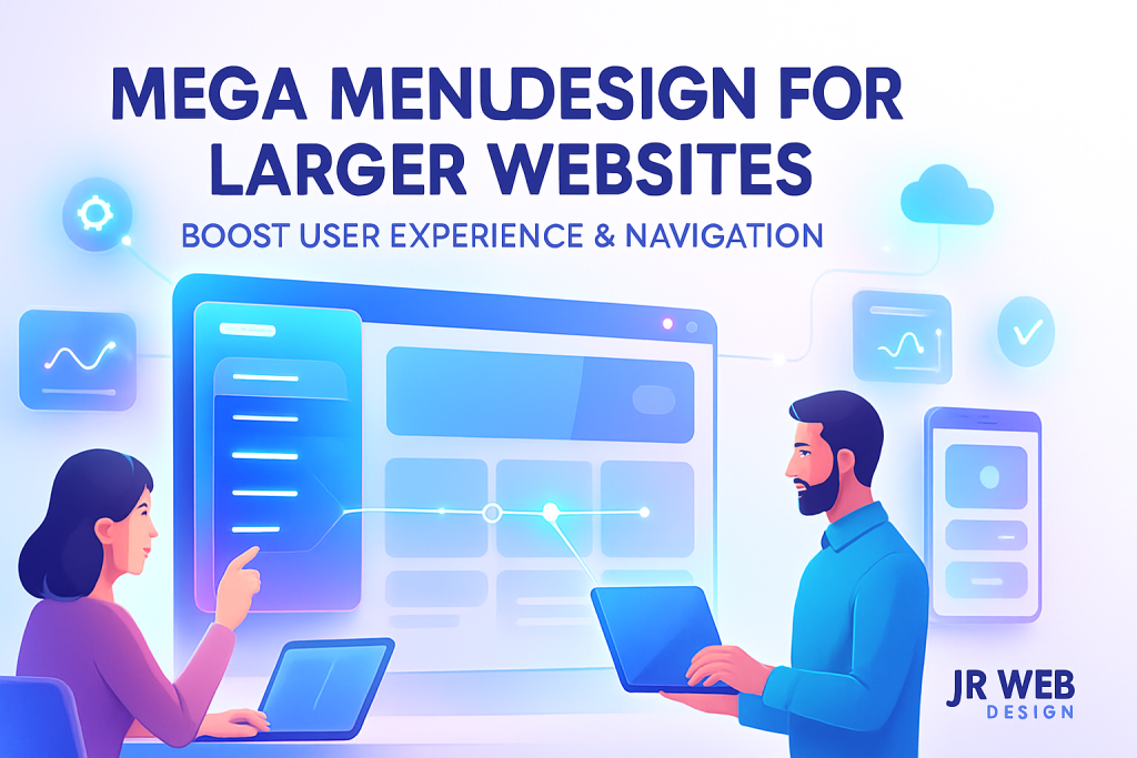
Mega Menu Design For Larger Websites
In today’s digital age, having a well-structured website is more crucial than ever, especially for larger businesses with extensive offerings. A mega menu is a powerful tool to enhance navigation, making it easier for users to find what they need without frustration. In this guide, we will explore the principles of mega menu design specifically for larger websites, covering user experience (UX), accessibility, speed, conversion, and modern website design considerations.
Understanding The Basics Of Mega Menus
A mega menu is a large dropdown menu that can display multiple categories and options at once. Unlike traditional dropdown menus, which can be limiting, a mega menu allows for a more expansive layout. This design choice is particularly beneficial for websites with a wide array of products or services, making navigation intuitive and user-friendly.
Why Use A Mega Menu?
For larger websites, a standard menu may not suffice. Here are a few reasons why a mega menu can be advantageous:
- Enhanced Navigation: Users can see all options at a glance and quickly find what they’re looking for.
- Showcases Content: Helps in highlighting various categories, special offers, and recent updates.
- Improved UX: Reduces the number of clicks needed to reach desired content, leading to increased satisfaction.
Key Considerations For Mega Menu Design
When creating a mega menu, consider the following aspects:
1. User-Centric Design
Always prioritise the user’s journey. Think about how they navigate your site and design your mega menu accordingly. Use clear labels for each category and avoid jargon.
2. Organisational Structure
Your menu should mirror the structure of your website. Organise categories logically to help users find related items. Group similar items together and use headings to separate different sections.
3. Visual Hierarchy
Utilise typography, colours, and spacing to create a visual hierarchy. Users should intuitively understand which items are primary and which are secondary.
4. Responsive Design
With a growing number of users accessing websites via mobile devices, ensure your mega menu is responsive. Consider how it will appear on smaller screens and adjust your layout accordingly.
Accessibility Matters
Accessibility is a crucial aspect of web design. Your mega menu should be usable by everyone, including those with disabilities. Here are some tips to enhance accessibility:
- Keyboard Navigation: Ensure that users can navigate your menu using a keyboard alone.
- Screen Reader Compatibility: Use ARIA roles and labels to ensure that your menu is understandable to screen readers.
- Contrast and Colour: Use high contrast colours to make text readable and provide options for colour-blind users.
Speed And Performance
A well-designed mega menu should not compromise your website’s speed. Here are some considerations:
- Optimise Images: If you use images in your mega menu, ensure they’re optimised for web use to reduce load times.
- Limit JavaScript: Heavy scripts can slow down your menu. Keep it lightweight and efficient.
- Cache Your Menu: Utilize caching strategies to reduce load times for returning visitors.
Boosting Conversion Rates
A well-structured mega menu can improve conversion rates. Here’s how:
- Highlight Key Offers: Use your mega menu to showcase promotions or bestsellers prominently.
- Clear Call-to-Action: Include buttons or links that lead users to desired actions, such as signing up or purchasing.
- Collect User Feedback: Implement tools to gather user insights and adapt your mega menu based on their needs.
Modern WordPress Design Angle
When integrating a mega menu into your WordPress website, consider utilising modern themes and plugins that offer built-in mega menu capabilities. Many of these themes are designed with flexibility in mind, allowing you to customise the layout and appearance of your menu to suit your brand. Look for themes that support:
- Customisation Options: This allows you to adjust colours, fonts, and spacing easily.
- Responsive Templates: Ensure your menu works seamlessly across devices.
- Performance Optimisation: Choose themes that prioritise speed and usability.
Additionally, plugins such as Max Mega Menu and WP Mega Menu can enhance your WordPress site’s navigation. These plugins make it easy to create stylish and functional mega menus without extensive coding knowledge. Consider also exploring other user-friendly plugins that provide additional features, like drag-and-drop builders, to simplify the creation process further. By leveraging these tools, you can create a visually appealing and highly functional mega menu that meets your users’ needs.
Testing And Iteration
After launching your mega menu, it’s essential to monitor its performance. Use tools like Google Analytics to track user behaviour and make adjustments as needed. Consider conducting A/B tests to see which menu layouts resonate best with users. Regularly seek feedback to ensure it’s meeting the needs of your audience. It’s also beneficial to observe how users interact with your mega menu over time, identifying any areas that may require refinement or enhancement. A continuous improvement approach will ensure your mega menu remains relevant and effective.
Conclusion
Designing a mega menu for larger websites can significantly improve user experience, accessibility, and conversion rates. By focusing on user-centric design, organisational structure, and modern WordPress practices, you can create a navigation system that enhances the overall functionality of your site. Remember to keep testing and iterating to ensure your mega menu remains effective as your website evolves. With the right approach, your mega menu can be a powerful asset in driving user engagement and conversions. Additionally, consider how integrating user feedback into your design process can lead to a continuously improving navigation experience, creating a more satisfying journey for your visitors. As web design trends continue to evolve, staying updated with the latest best practices in mega menu design will keep your website competitive and user-friendly.
Related posts
- Designing Website Search Results Pages for Usability: Enhance User Experience with Effective WordPress Strategies
- Using Whitespace Effectively In Professional Web Design For Better User Experience And Improved Conversions
- Setting Up Consent Mode and Privacy-Friendly Analytics: A Practical Guide for WordPress Users