WordPress Article
Visual Hierarchy Techniques For Longer Website Pages: Boost Readability and Engagement with Effective Design Strategies
A practical guide to visual hierarchy techniques for longer website pages, including UX, accessibility, speed, conversion, and modern website design decisions for better results.
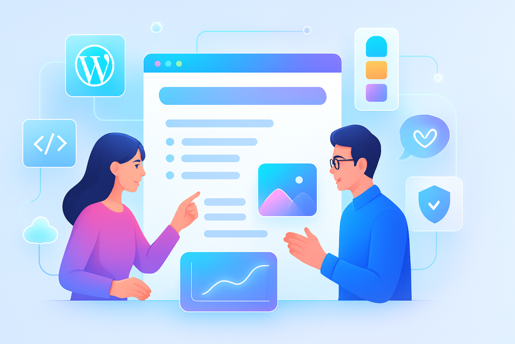
Unlock the Power of Visual Hierarchy
Learn how to effectively use visual hierarchy on longer web pages to enhance user experience and conversion rates.
Understanding Visual Hierarchy
Visual hierarchy is a design principle that organises elements on your web page to guide the viewer’s eye. It’s essential, especially for longer pages where users may easily feel overwhelmed. By establishing a clear visual hierarchy, you can enhance readability, improve user experience (UX), and ultimately drive conversions.
Why Visual Hierarchy Matters
For beginners, understanding the significance of visual hierarchy is crucial. It helps users navigate your content effortlessly, making it more accessible. Think of it as the roadmap that leads visitors through your web page.
Here are some benefits:
- Improved readability and comprehension
- Enhanced user engagement
- Higher conversion rates
Key Techniques for Implementing Visual Hierarchy
Now that you understand its importance, let’s delve into specific techniques you can apply:
1. Use Size and Scale
Size plays a crucial role in establishing hierarchy. Larger elements naturally draw more attention. For instance, make headlines larger than body text. This contrast helps users distinguish between different sections quickly.
2. Employ Colour and Contrast
Colour can guide users’ attention. Use contrasting colours for call-to-action (CTA) buttons or important information. A bright button against a neutral background stands out and invites clicks.
3. Implement White Space
White space, or negative space, is essential for creating breathing room around your content. It prevents clutter and highlights important elements. Experiment with generous margins and paddings to find the right balance.
4. Organise with Grids
Using a grid layout can help maintain order on longer pages. It provides a structured format that users find easier to digest. Your design should facilitate a smooth flow, leading users from one section to the next.
5. Establish Visual Flow
Guide your users’ eyes by establishing a visual flow through your elements. You can achieve this by aligning elements or using directional cues, like arrows or images that point toward CTAs.
Modern WordPress Design Angle
When it comes to implementing visual hierarchy on longer pages, modern WordPress themes provide a fantastic foundation. Many themes are built with visual hierarchy in mind, offering features like:
- Customisable header sizes
- Multiple colour schemes
- Flexible grid layouts
Plugins like Elementor or WPBakery allow for drag-and-drop editing, making it easier to apply these visual hierarchy techniques without any coding knowledge. The benefit of using these tools is that they often come packed with templates that already adhere to good design practices, saving you time and effort.
Moreover, responsive design is a key element in modern WordPress themes, ensuring that your visual hierarchy remains intact on mobile devices. Given that more users are browsing on their phones, it’s vital to create a seamless experience across all platforms.
Adopting Plugins for Enhanced Design
Integrating the right WordPress plugins can significantly enhance your website’s design and functionality. Here are some types of plugins that can help maintain visual hierarchy:
- SEO Plugins: Tools like Yoast SEO can help optimise your content for search engines, ensuring that your visually appealing design also attracts traffic.
- Performance Plugins: Plugins like WP Rocket can improve loading speeds, enhancing user experience and maintaining engagement.
- Accessibility Plugins: Consider plugins that improve accessibility, allowing all users to navigate your site effectively.
Each of these plugins not only enhances the functionality of your site but also supports the visual hierarchy principles you’re implementing. By ensuring that your website is accessible and fast, you further encourage users to engage with your content.
Testing and Iteration
Creating a visually appealing page isn’t a one-and-done task. It’s crucial to continually test and iterate your design. Tools like Google Analytics can help you track user engagement. Are they scrolling down? Are they clicking on your CTAs? Use this data to refine your approach.
Additionally, conducting A/B tests can provide insights into which design elements resonate better with your audience. Test different headlines, colours, and layouts to see which combinations yield the best engagement.
Conclusion
In summary, visual hierarchy is a powerful tool in your web design arsenal, especially for longer website pages. By applying these techniques—size, colour, white space, grids, and visual flow—you can create a user-friendly experience that encourages engagement and conversion. With modern WordPress themes and plugins, implementing these strategies has never been easier. Embrace the principles of visual hierarchy and watch your website thrive.
As you navigate through your design journey, remember that the user experience is paramount. By continually evaluating and refining your approach, you can ensure that your website remains not only visually appealing but also functional and engaging.
Additional Considerations for WordPress Users
Beyond the basics of visual hierarchy, it’s essential to explore additional considerations that can further enhance your WordPress site. One aspect to consider is the integration of social proof elements such as testimonials and reviews. These can be visually highlighted using styling techniques that align with your hierarchy, adding credibility and encouraging trust.
Another consideration is the use of multimedia elements. Incorporating images, videos, or infographics can break up long sections of text and provide visual interest. However, ensure these elements are optimised for size and loading speed to maintain overall site performance.
Furthermore, consider the importance of typography in your design. Choose fonts that are easy to read and complement your visual hierarchy. A well-chosen font can significantly impact how users perceive your content and can contribute to a more polished overall look.
Lastly, keep in mind the importance of user feedback. Encourage visitors to share their thoughts on your website’s usability and design. This feedback can provide invaluable insights and help you make informed decisions for future updates.
Related posts
- Advanced Website Caching Strategies for Faster Load Times: Practical WordPress Insights for Small Businesses
- Creating Consistent Icon Systems for Websites: Boost UX and Trust with Modern WordPress Design
- Visual Storytelling on Long-Form Sales Pages: Boosting Engagement and Conversions with Modern Design Strategies