WordPress Article
Modern Sidebar Layouts That Still Work On Mobile: Boost Your Website’s Usability and Design
A practical guide to modern sidebar layouts that still work on mobile, including UX, accessibility, speed, conversion, and modern website design decisions for better results.
Unlocking the Power of Sidebar Layouts
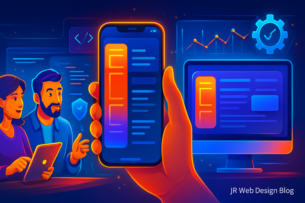
Modern Sidebar Layouts That Still Work On Mobile
In today’s digital landscape, the importance of a well-structured website cannot be overstated. For small business owners, tradies, and website owners, having a sidebar that functions effectively on both desktop and mobile devices is crucial. Whether you’re running a blog, a service business, or an online shop, understanding how to implement modern sidebar layouts can significantly enhance user experience (UX) and potentially boost conversions.
This article delves into practical strategies for integrating modern sidebar layouts that still work on mobile. We’ll cover everything from user experience and accessibility to speed and conversion, ensuring you have the tools needed for an effective web presence.
Why Sidebars Matter
Sidebars play a pivotal role in website navigation. They can house important information, direct users to relevant content, and ultimately guide visitors toward taking desired actions. Here’s why effective sidebar design is essential:
- Provides easy access to important links and information.
- Enhances the visual appeal of your website.
- Can drive conversions through strategic placement of calls to action (CTAs).
However, with the rise of mobile browsing, traditional sidebar layouts must evolve to accommodate different screen sizes without sacrificing functionality.
Designing for Mobile: Best Practices
Designing a sidebar that works well on mobile involves several considerations. Here are some best practices to ensure your sidebar remains effective:
1. Responsive Design: Ensure your sidebar adjusts seamlessly across different devices. The use of grid systems and flexible layouts can help achieve this.
2. Prioritise Content: On mobile, space is limited. Focus on the most critical elements of your sidebar, such as CTAs, contact information, or essential links.
3. Collapsible Menus: Consider implementing collapsible or expandable menus. These allow users to access sidebar content with a simple tap, enhancing usability.
4. Use Clear Typography: Ensure that text is legible on smaller screens. Use larger fonts and adequate spacing to improve readability.
5. Limit Visual Clutter: Avoid overcrowding your sidebar with too many elements. A clean, minimal design keeps the focus on essential information.
Accessibility Considerations
Accessibility is integral to modern web design. A well-designed sidebar should cater to all users, including those with disabilities. Here are some tips:
– Use descriptive link text to help screen reader users understand where links will take them.
– Ensure sufficient colour contrast to make text readable against the background.
– Incorporate keyboard navigation to allow users who cannot use a mouse to navigate easily.
– Avoid using images as text; instead, use HTML text to improve accessibility.
– Regularly test your site with accessibility tools to ensure compliance with standards.
Modern WordPress Design Angle
WordPress is a fantastic platform for building websites with modern sidebar layouts. Many themes now come equipped with pre-designed sidebars that are mobile-friendly. Here are some key aspects to consider within the WordPress ecosystem:
– Theme Selection: Choose a responsive WordPress theme that supports custom sidebar layouts. Themes like Astra and OceanWP allow for great flexibility in design.
– Plugins for Customisation: Plugins like Elementor and Beaver Builder enable you to create tailored sidebar designs without needing to code.
– Utilise Widget Areas: Make use of WordPress’s widget areas to dynamically populate your sidebar with relevant content such as recent posts, testimonials, or social links.
– Ensure Speed Optimisation: A cluttered sidebar can slow down your website. Focus on a minimalist design that prioritises speed without sacrificing essential information.
– Regular Updates: Keep your themes and plugins updated to benefit from the latest features and security enhancements.
Testing and Iteration
After implementing your new sidebar layout, it’s essential to test how it performs. Use tools like Google’s Mobile-Friendly Test to assess usability on mobile devices. Gather feedback from users to identify areas for improvement.
Remember, web design is iterative. Don’t hesitate to adjust elements based on user interaction data or testing results. Small changes can have a significant impact on usability and conversion rates.
Consider A/B testing different sidebar designs to determine which layout yields the best results in terms of user engagement and conversions.
Conclusion
Creating modern sidebar layouts that work effectively on mobile is essential for any website. With responsive design, clear accessibility practices, and the right WordPress tools, you can enhance your website’s UX and drive higher conversions. Remember, simplicity and functionality should guide your design choices.
As a small business owner, tradie, or website owner, investing time in this aspect of your site can pay dividends in the long run. Stay updated with modern design trends and continuously refine your sidebar to ensure it meets both user needs and business goals.
By embracing these strategies, you not only improve your website’s usability but also create a more engaging experience for your visitors. The synergy of an effective sidebar layout can lead to improved navigation, increased time on site, and ultimately higher conversion rates.
Advanced Sidebar Techniques
To further enhance the functionality of your sidebar, consider implementing advanced techniques that can provide greater engagement and utility. Here are some additional strategies:
– Dynamic Content: Use plugins that allow your sidebar to display dynamic content based on user behavior or preferences. This can include personalized recommendations or tailored CTAs that react to user interactions.
– Social Media Integration: Incorporate social media feeds to keep your content fresh and encourage visitors to engage with you across multiple platforms. This can help in building a community around your brand.
– Search Functionality: Including a search bar in your sidebar can help users find content quickly, enhancing their overall experience on your site.
– Newsletter Sign-Up: Utilize your sidebar to promote newsletter subscriptions. This can be a valuable tool for building a mailing list and keeping your audience informed about updates and promotions.
– Analytics Tracking: Implement tracking for your sidebar interactions to better understand user behavior and optimize your layout based on data-driven insights.
Each of these techniques can contribute to a more interactive and personalized user experience, ultimately leading to higher engagement and conversion rates.
Staying Ahead: Future Trends in Sidebar Design
As web design continues to evolve, staying ahead of trends is crucial. Here are some future trends in sidebar design to watch:
– Minimalist Aesthetics: The trend towards minimalism will continue, with more websites opting for clean, simple sidebars that focus on essential information.
– Micro-Interactions: Incorporating subtle animations and micro-interactions can enhance user engagement, making the sidebar feel more dynamic and interactive.
– Voice Search Integration: As voice search technology improves, designing sidebars that accommodate voice commands could become a valuable feature for enhancing accessibility and user experience.
– AI-Driven Personalization: Leveraging AI to tailor sidebar content based on user behavior and preferences can create a more engaging experience.
– Augmented Reality Elements: As AR technology becomes more mainstream, integrating AR elements into sidebars could provide unique interactive experiences.
Staying informed about these trends will help you keep your website’s sidebar modern and effective, ensuring it continues to meet user needs and enhance overall site performance.