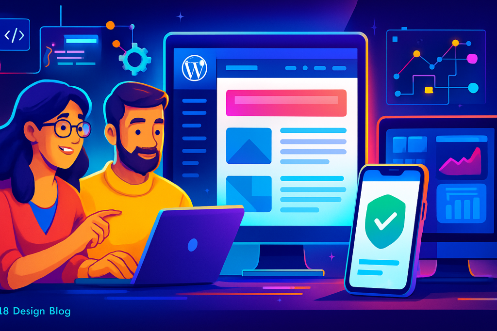
WordPress Article
Advanced Website Navigation Patterns For Large Content Sites
A practical guide to advanced website navigation patterns for large content sites, including UX, accessibility, speed, conversion, and modern website design decisions for better results.
Unlocking the Power of Navigation
Effective navigation is the backbone of any large content website. It’s not just about links; it’s about guiding users seamlessly through your content.
Understanding Navigation Patterns
When designing a site with substantial content, it’s vital to consider how users will navigate that content. Good navigation helps users find what they want quickly and efficiently, which can significantly improve user experience (UX), engagement, and conversions.
1. Mega Menus: Expansive Options at a Glance
Mega menus are becoming increasingly popular for large sites. They allow you to display a vast range of options in a single dropdown, making it easy for users to find what they need without digging deep into submenus.
These menus can include:
- Images and icons to improve visual understanding
- Subcategories for detailed browsing
- Call-to-action buttons for important content
2. Breadcrumb Navigation: A Clear Path
Breadcrumbs are an excellent navigation aid for large content sites. They show users their current location within the site hierarchy and provide an easy way to backtrack.
This pattern is particularly useful for:
- E-commerce sites with multiple product categories
- Blogs with extensive archives
- Corporate sites with several service offerings
3. Filter and Faceted Navigation: Tailored User Experience
For sites with a large volume of products or articles, filter and faceted navigation can greatly enhance usability. Users can refine their search results based on specific criteria, making it easier to find relevant content.
Consider implementing filters for:
- Price ranges
- Categories
- Ratings
4. Sticky Navigation: Always Within Reach
Sticky navigation remains visible as users scroll down the page. This feature ensures that essential links are always accessible, making it easier for users to navigate without returning to the top.
Use sticky navigation wisely to maintain a clean design while enhancing user experience.
5. Tabbed Navigation: Organised Content Structure
Tabbed navigation allows users to switch between different sections of content without leaving the page. This is particularly effective for product descriptions, FAQs, or multi-step forms.
Keep it simple and intuitive to encourage users to explore all available options.
Modern WordPress Design Angle
When building advanced navigation systems, leveraging modern WordPress design principles is crucial. Themes built with Gutenberg blocks offer flexibility for incorporating these navigation patterns.
Consider the following when choosing a WordPress theme:
- Responsive design for mobile-friendliness
- Customisation options to tailor navigation to your needs
- Fast loading speeds to enhance user experience
Implementing these elements will not only improve navigation but also build trust with your audience. A well-designed site reflects professionalism and attention to detail.
6. Mobile Navigation: Prioritise Mobile First
With a significant number of users browsing on mobile devices, ensuring that your navigation is mobile-friendly is non-negotiable. Consider using a hamburger menu to save space, but ensure it’s easy to access and understand.
Test your mobile navigation thoroughly to ensure a seamless experience across all devices. The goal is to create a consistent experience whether users are on desktop or mobile.
7. Search Functionality: Empower Your Users
A robust search function can be a lifesaver for large content sites. Make sure your search bar is prominently placed and easy to use. Advanced features such as autocomplete suggestions can enhance user experience further.
Integrating plugins like SearchWP can improve your search capabilities, ensuring users find the content they need quickly. Additionally, consider implementing a search analytics tool to understand user behavior and improve your content strategy.
8. User-Centric Design: Know Your Audience
Understanding your audience is key to creating effective navigation. Conduct user testing and gather feedback to find out what works for your visitors. This can guide your design decisions and help you refine your navigation strategies.
Tools such as heatmaps and session recordings can provide insights into how users interact with your site, allowing for continuous improvement.
9. Visual Hierarchy: Directing User Attention
Establishing a clear visual hierarchy helps users understand where to focus their attention. Use size, color, and spacing strategically to guide users through your navigation options effectively.
For example, larger fonts can indicate primary navigation links, while smaller fonts can denote secondary options. Consistency in design elements reinforces user familiarity and aids navigation.
10. Testing and Iteration: Continuous Improvement
Once your navigation system is in place, ongoing testing and iteration are essential. Regularly assess the effectiveness of your navigation patterns by analyzing user metrics and feedback.
A/B testing different navigation layouts can provide valuable insights into what works best for your audience. Stay agile and be prepared to make adjustments based on user behavior and emerging trends.
Conclusion: Navigating Success
Advanced navigation patterns for large content sites are essential for improving user experience and driving conversions. By implementing strategies such as mega menus, breadcrumbs, and sticky navigation, you can create an intuitive browsing experience.
Don’t forget the importance of modern WordPress design practices in this mix. By staying updated with the latest design trends and leveraging the power of WordPress, you can build a website that not only looks great but functions seamlessly.
Take the time to assess your current navigation structure and consider how these advanced patterns can benefit your site. Your users will thank you! In the end, a well-thought-out navigation system can significantly contribute to the overall success of your website, enhancing both user satisfaction and retention.
In addition to the aforementioned strategies, consider integrating user feedback tools. These can provide real-time insights into how users interact with your navigation. Tools like surveys or feedback forms can help you gather valuable information about user preferences and pain points.
Moreover, continuous education on emerging web design trends can keep your navigation fresh. Attending workshops or webinars can help you stay ahead of the curve and adopt new techniques that enhance user engagement.
Furthermore, collaboration with UX designers can provide a fresh perspective on your navigation structure. They can offer insights into usability and accessibility, ensuring that your navigation caters to all users, including those with disabilities.
Lastly, remember that navigation is not a one-time task. As your content grows and evolves, so should your navigation. Regularly revisiting and refining your navigation strategies will keep your website user-friendly and aligned with user expectations.